worth engineering
2020
I had worked with Heath Steele for years in a professional capacity, so when he called me out of the blue to say he was striking out on his own and wanted help designing a logo, I was immediately on board. There was just one catch: he didn’t have a name yet.
So we talked. Not just about logos or color palettes, but about values, aspirations, and the kind of firm he wanted to build. Heath spoke with real intention about collaboration, care, and creating an environment where people, clients and team members alike, felt seen and supported. A recurring theme in our conversation was togetherness. He kept saying “we.”
That word stuck. We. W. E. Well the E obviously would stand for engineering. But what’s the W stand for? Based in Fort Worth, the answer practically revealed itself: Worth. WE instantly took shape: simple, bold, and layered with meaning. It captured not just the firm’s location, but its philosophy: engineering worth into every project, bringing value through expertise and human connection. The taglines practically wrote themselves at that point.
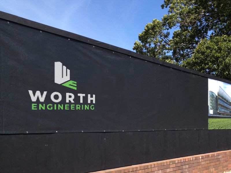
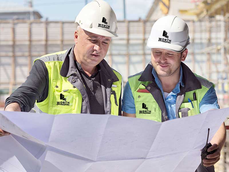
With the name locked in, we turned to the mark. The goal was a visual identity with dual purpose: something clean and professional enough for engineering documentation, yet bold enough to stand alone on a hardhat or job site sign. The final logo is a tightly constructed mark: a W forming a building’s silhouette casting an E as a shadow on an imaginary plane.
Color played a key role in differentiating the brand within the MEP (Mechanical, Electrical, and Plumbing) space. Since MEP systems are where real sustainability benchmarks are often set, we chose a bold green as the hero color — a hue that sits somewhere between “sustainability-forward” hunter green and high-vis “don’t-hit-me-with-a-skid-steer” neon lime. It’s unmistakable on a job site.